Appearance
Graph Settings
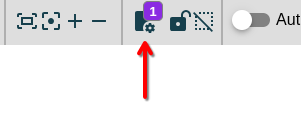
By clicking on the graph settings icon in the top menu, you can quickly view and toggle the active visual settings for your graph. This panel provides a convenient overview without navigating to the full settings menu.
Quick Settings Panel
The panel displays settings that affect your graph's visual representation:
- See active settings: View which options are currently influencing the graph's layout and content
- Toggle settings: Use the quick on/off switches to immediately see the effect of each setting
- Access full controls: Click OPEN SETTINGS to access the complete list of customization options at
Visual Settings Overview
Relation Display Settings
| Setting | Effect | When to Use |
|---|---|---|
| Rotate relation names | Labels display parallel to relation arrows instead of horizontal | Cleaner look for diagonal relations |
| Hide properties | Terms of type "Property" are hidden from the graph | Focus on main concepts without attributes |
| Hide Relation Types | Only show selected relation types | Simplify complex graphs by filtering relations |
| Color Relation Types | Each relation type gets a unique color | Quickly distinguish relationship categories |
| Relation Types Legend | Shows a color legend for relation types | Reference when using colored relations |
| Cardinality for Relations | Enable cardinality notation on relations | Define one-to-many, many-to-many relationships |
Term Display Settings
| Setting | Effect | When to Use |
|---|---|---|
| Scale Term Size | Term box size varies based on connections | Visualize term importance by connectivity |
| Scale Term Color | Term color varies from green to red based on metrics | Heat map visualization of weights or connections |
| Use Term Weights | Adds a weight field to terms | Quantify term importance for analysis |
| Use Relation Weights | Adds a weight field to relations | Quantify relationship strength |
| Term Icons Legend | Shows a legend for dynamic icons defined in Extra Fields | Reference when using custom icons for statuses or categories |
Inheritance Settings
| Setting | Effect | When to Use |
|---|---|---|
| Inherit relations | Child terms display inherited relations from parents | Show full relationship context in hierarchies |
Node Shapes
Termboard supports multiple shapes for terms, accessible via the term shape selector in the menu bar:
| Shape | Best Used For |
|---|---|
| Rectangle | Standard terms, concepts |
| Round Rectangle | Softer appearance, processes |
| Ellipse | Start/end points, actors |
| Diamond | Decision points, conditions |
| Hexagon | Interfaces, APIs |
| Triangle | Warnings, special markers |
| Barrel | Databases, storage |
| Tag | Labels, categories |
| Star | Important highlights |
| Image | Custom icons or photos |
To change a term's shape:
- Select one or more terms
- Click the shape selector in the menu bar
- Choose the desired shape
Or right-click a term and use Apply style to selected > Shape/image to copy from another term.
Edge (Relation) Styling
Configure relation appearance in the menu bar:
| Style Option | Choices |
|---|---|
| Line Style | Solid, Dashed, Dotted |
| Line Size | Thin to thick (1-10px) |
| Line Color | Any color via picker |
| Line Type | Straight, Angled (bendpoints), Curved (control points) |
| Arrow Position | Target, Source, Both, None |
Bend Points vs Control Points
Bend Points: Create sharp angles in relation lines
- Right-click a relation > Add Bend Point
- Drag bend points to adjust the angle
Control Points: Create smooth curves
- Right-click a relation > Add Control Point
- Drag control points to adjust the curve
Color Schemes
Term Colors
Set colors for terms via the menu bar:
- Border Color: Outline color of the term box
- Background Color: Fill color of the term box
- Font Color: Text color (or "automatic" for contrast-based)
Relation Colors
- Line Color: Color of the relation line
- Font Color: Color of the relation label
Conditional Formatting
Use Extra Fields with Scale Term Color to create automatic color coding:
- Define an extra field (e.g., "Status" or "Priority")
- Set values for terms
- Enable Scale Term Color in document settings
- Choose the metric (term weight, relation weight, or connection count)
Alternatively, use Field-based Selection to select and style terms by field values:
- Filter terms by a field value
- Select the matching terms
- Apply a consistent color to the selection
Layout Configuration
Arrange your graph automatically using :
| Layout | Best For |
|---|---|
| Compact/Wide/Widest | General-purpose, balanced spacing |
| Hierarchy | Tree structures, taxonomies |
| Grid | Organized rows and columns |
| Cola | Nice view for smaller gaphs <100 terms |
Layout options:
- Which Elements: Apply to all or selected only
- Randomize: Start fresh or optimize current positions
- Max run time: Longer = better results for large graphs
- Direction: For hierarchy layout (up-down, left-right)
See Arrange Automatically for detailed layout options.
Default Styles
Set default styles for new elements:
- Style a term or relation as desired
- Right-click and select Set this style as default
All newly created elements will use these styles.
Related Documentation
- Canvas - Full styling toolbar reference
- Settings - Complete document settings
- Relation Types - Semantic relation categories
- Extra Fields - Custom metadata and conditional formatting
- Arrange Automatically - Layout algorithms