Appearance
Extra Fields
To select this option:
With Extra Fields, you have the ability to add custom data fields to both your terms and relations. Once created, these fields become accessible within the term sidebar and relation sidebar, allowing you to view and modify their values.
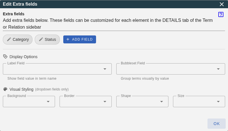
The dialog is organized into two main areas:
Managing Fields
At the top of the dialog, you'll see your existing extra fields displayed as clickable chips (with a pencil icon). Click on any field to edit its properties. Use the + Add field button to create new extra fields. Both actions open a separate configuration window, as detailed in the next section.
Field Mapping Settings
Below the field list, you'll find options to control how extra field data is displayed in your graph. These are organized into two sections:
Display Options
- Label Field: Appends the selected field's value to the displayed name of each term in the graph.
- Bubbleset Field: Creates visual groupings ("bubblesets") of terms that share the same value, helping identify clusters of related terms.
Visual Styling
These options allow you to customize graph appearance based on field values. Dropdown, boolean, and hierarchy-level fields can be used here:
- Term Background: Sets term background colors based on field values.
- Term Border Color: Sets term border colors based on field values.
- Term Border Style: Sets term borders to solid or dashed based on field values.
- Term Shape: Changes term shapes based on field values.
- Term Size: Adjusts term sizes based on field values.
- Term Icon: Displays a specific icon on the term based on field values.
- Relation Line Color: Sets relation line colors based on field values.
- Relation Line Style: Sets relation lines to solid or dashed based on field values.
Add or Edit a Field
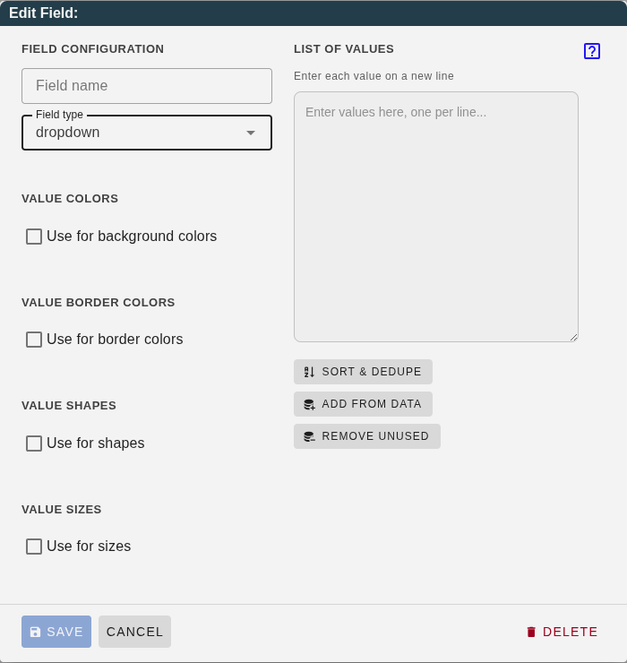
The dialog title changes based on whether you're creating a new field ("Add New Field") or editing an existing one ("Edit Field: [name]").
Field Configuration
- Field name: Enter a descriptive name for your extra field (e.g., "Priority", "Status", "Category").
- Field type: Choose the data type and behavior:
- text: A simple text input field for free-form text.
- date: A date picker field for storing and displaying dates.
- dropdown: A dropdown menu with predefined values. Users select one value from the list.
- multi-value: Like dropdown, but users can select and assign multiple values.
- link: A text field for web addresses (URLs) that become clickable links.
- hierarchy-level: Automatically assigns level names (e.g., "Domain", "Category") based on term depth in a hierarchy.
- hierarchy-branch: Automatically assigns branch names based on a common ancestor, useful for coloring entire sub-trees.
- Scope: Choose which elements this field applies to:
- Terms: Field only appears in the term sidebar.
- Relations: Field only appears in the relation sidebar.
- Both: Field appears in both sidebars (default).
- Visible Term Types: For more granular control, select specific term or relation types this field should apply to. If left empty, the field applies to all types within the chosen scope. This is particularly useful for specialized domain profiles like Business Analysis, where a "Compliance Status" field is only relevant for "Evaluation" nodes.
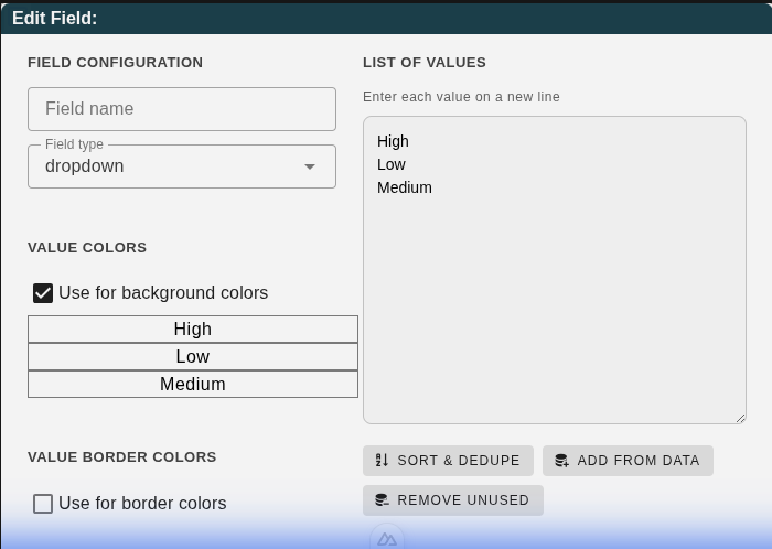
List of Values
When you select "dropdown" or "multi-value" as the field type, a values section appears. Enter each value on a new line in the textarea.
The action buttons help manage your values:
- Sort & Dedupe: Sorts values alphabetically and removes duplicates.
- Add from Data: Scans your existing terms/relations and adds any values already in use.
- Remove Unused: Removes values that aren't currently assigned to any term or relation.
Visual Styling Options
For dropdown fields, additional styling sections appear depending on the field's Scope:
- Use for background colors: Assign colors to term backgrounds (Terms scope).
- Use for border colors: Assign colors to term borders (Terms scope).
- Use for line colors: Assign colors to relation lines (Relations scope).
- Use for shapes: Assign different shapes to terms.
- Use for sizes: Assign different sizes to terms.
- Use for icons: Assign MDI icons to terms (overrides default type icons).
- Use for border/line style: Assign solid or dashed styles (Boolean fields only).
Styling with Boolean Fields
For boolean fields, you can only configure Border Style (for Terms) or Line Style (for Relations). The mapping is fixed for simplicity:
- true: Dashed line/border
- false: Solid line/border
This is particularly useful for indicating status, such as "Suspected" or "Incomplete" elements.
Click on any value in these sections to open a color picker or selection menu. Once configured, these styles are automatically applied to graph elements based on their field values.
Hierarchy Fields
Both hierarchy-level and hierarchy-branch fields are powerful tools for automatically categorizing terms based on their position in a hierarchy.
Hierarchy-Level
Use this field type to assign depth-based labels to terms. For example, in a taxonomy:
- Level 0: "Domain" (root terms)
- Level 1: "Category"
- Level 2: "Subcategory"
- Level 3: "Item" (leaf terms)
Configuration:
- Relation Type: Select which relation defines the hierarchy (e.g., Generalization for "is-a" relationships).
- Direction: Choose how edges represent parent-child:
- Upstream (follow arrows): Arrows point from child to parent (e.g., "Dog → Animal")
- Downstream (against arrows): Arrows point from parent to child (e.g., "Animal → Dog")
- Click Analyze Hierarchy to detect levels.
- Customize level names and assign colors.
- Click Update Values in Terms to apply.
Hierarchy-Branch
Use this field type to color entire sub-trees based on a common ancestor. All terms descending from a "branch head" share the same value and color.
Configuration:
- Relation Type: Select which relation defines the hierarchy.
- Direction: Choose how edges represent parent-child (same as hierarchy-level).
- Split Level: The depth at which branch heads are determined. For example:
- Split Level 0: Root terms are branch heads
- Split Level 1: Second-level terms are branch heads
- Click Analyze Branches to detect branch heads.
- Assign colors to each branch.
- Click Update Values in Terms to apply.
Example: In a taxonomy with "Animals" → "Mammals"/"Birds" → "Dog"/"Cat"/"Eagle", setting split level to 1 would make "Mammals" and "Birds" the branch heads. All their descendants would inherit their branch's color.