Appearance
Canvas
The Canvas provides an intuitive and visual Graph View for editing your Terms and Relations. This graphical representation significantly enhances your understanding of your model or mind map by making connections and structures immediately apparent. Beyond simple visualization, the graph also offers a range of advanced features for editing and navigating your diagrams efficiently.
Menu Bar
Located at the top of the page, the Menu Bar provides access to various functions for managing your files, styling your graph, and controlling the application's behavior.
Left: Menu Section
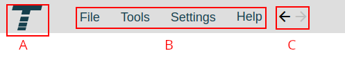
- A: Termboard Home: Click the Termboard icon to return to the application's home screen.
- B: Main Menu: Access the primary application menus:
- File: Manage your documents with options for saving, loading, importing, exporting, creating backups, and exploring examples.
- Tools: Access various utilities and features to assist in building and manipulating your model.
- Settings: Configure both document-specific settings and general application-wide preferences.
- Help: Find resources such as manuals, video tutorials, options for reporting issues, and access to frequently asked questions.
- C: Navigation History: Use these buttons to move through your selection history. If you've clicked on a series of Terms, you can use the Back button to return to previously selected Terms and the Forward button to move forward through your selection history.
Middle: Graph Styling
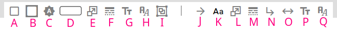
These options allow you to visually customize the appearance of your graph elements. The controls are divided into two sections: the first set (A-H) affects the styling of Terms (nodes), and the second set (I-P) controls the styling of Relations (edges).
- A: Term Border Color: Click to open a color picker and select the color for the border surrounding your Terms.
- B: Term Background Color: Click to open a color picker and choose the background color for your Terms.
- C: Term Name Font Color: Select the color for the text displaying the Term's name. Choose "automatic" to have the color dynamically switch between black and white for optimal contrast against the background color, or select a specific color from the picker.
- D: Term Shape: Choose the visual shape for your Terms from the available options. You can also:
- Drag the main shape icon directly onto the canvas to quickly create a new Term with that shape.
- Drag a shape from the submenu onto the canvas to create a new Term with that specific shape.
- Select an image from a web link to use as the visual representation of a Term. Use one of the options provided above. Right-click on an image and select "Copy image address". Paste it into the URL field. Or drag the image to the canvas (tutorial)
- E: Term Shape Size: Adjust the overall size of the Term shapes using the input fields.
- F: Term Border Style: Select the style for the Term's border, such as solid, dashed, or dotted lines.
- G: Term Name Font Size: Control the size of the font used to display the Term's name.
- H: Term Name Font Type: Choose the font family for the Term's name from the available options.
- I: Term Group Padding: Padding refers to the spacing around the content within a Term Group. This setting applies universally to all groupings in Termboard; you can't customize padding for individual selections of groupings. To create a Group see Group Selected in the Context Menu
- J: Relation Line Color: Click to open a color picker and select the color for the lines representing the Relations between Terms.
- K: Relation Font Color: Select the color for the text displaying the Relation's name.
- L: Relation Line Size: Adjust the thickness of the Relation lines.
- M: Relation Line Style: Select the style for the Relation lines, such as solid, dashed, or dotted lines.
- N: Relation Bend/Control Points: Determine the visual style of the Relation lines:
- Straight line: Relations will be drawn as direct lines between connected Terms.
- Angled: Relations will be drawn with sharp angles (bendpoints) if adjusted.
- Curved (Control points): Relations will be drawn with smooth curves, controlled by adjustable control points on the line.
- O: Relation Arrow Positions: Choose where arrowheads should appear on the Relation lines to indicate directionality:
- Target: Arrowhead at the end of the line pointing to the target Term.
- Source: Arrowhead at the beginning of the line originating from the source Term.
- Both: Arrowheads at both ends of the line.
- No arrows: No arrowheads will be displayed.
- P: Relation Name Font Size: Control the size of the font used to display the Relation's name.
- Q: Relation Name Font Type: Choose the font family for the Relation's name from the available options.
Right: Graph Controls
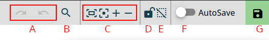
- A: Undo/Redo: Use these buttons to revert the last action you performed on the graph (Undo) or reapply an action that was previously undone (Redo).
- B: Search and Navigate: Click this button to open a search bar. Type the name of a Term, and Termboard will highlight matching Terms in the graph. Selecting a Term from the search results will center it in your view.
- C: Center and Zoom: Click these buttons to automatically adjust the zoom level and pan the graph so that all elements are visible and centered within the canvas.
- D: Lock Term Positions: Toggle this button to lock or unlock the positions of all Terms in your graph. When locked, you cannot drag or reposition any Terms. This is useful for preventing accidental movement once you have a desired layout.
- E: Reset Selections and Highlights: Click this button to clear any currently selected Terms or Relations and remove any highlighting that might be active in the graph.
- F: Enable Autosave: Toggle this button to enable or disable the automatic saving of your work at regular intervals. When enabled, Termboard will periodically save your progress without requiring manual intervention.
- G: Save Status: This indicator provides feedback on your saving status:
- Green: Indicates that all changes to your graph have been successfully saved.
- Yellow: Indicates that there are unsaved changes in your graph. Click this indicator to manually save your current work using a professional, themed dialog.
Context Menus
Right-clicking on the canvas, a Term, or a Relation will bring up a context-sensitive menu with options relevant to what you've clicked on.
Canvas Menu
Right-clicking on an empty area of the canvas will display the following options:
- Add ▸: Options for adding new elements:
- Add Term: Creates a new, empty Term at the location of your click. (Shortcut:
Shift+clickorCtrl+I). - Add Multiple Terms: Opens a dialog to bulk-add Terms.
- Add Relation Connection Point ▸: Adds intermediate points (AND/XOR logic) to connect multiple Relations.
- Add Term: Creates a new, empty Term at the location of your click. (Shortcut:
- Select/Highlight ▸: Advanced filtering for selecting or highlighting elements based on type, color, or descriptions.
- Layout ▸: Options for positioning:
- Auto Reposition: Opens the auto reposition sidebar.
- Align selected ▸: Align Terms to a common edge (Left, Right, Top, Bottom).
- Auto position selection: Arrange only the currently selected elements.
- Move here: Moves selected Terms around your click location.
- Groups ▸: Manage groupings:
- (Un)Group selected: Add to new/existing Groups or remove from Groups.
- Collapse/Expand all groups: Toggle visibility of all Group containers.
- Copy/Paste ▸:
- Copy (
Ctrl+C): Copy selection to clipboard. - Paste (
Ctrl+V): Paste from clipboard. - Paste as... ▸: Paste text as a new Term's name or description.
- Copy (
- Lock/Unlock ▸: Fix or release the positions of all or selected Terms.
- Delete selected: Removes the currently selected elements.
- More ▸: Access additional options like Help.
Term Menu
Right-clicking on a Term brings up a menu for interacting with that specific Entity.
- Rename (
Ins): Directly modify the Term's label. - Select/Highlight ▸: Select or highlight other Terms based on visual properties (shape, color, name) or connectivity (incomers/outgoers, including recursive paths).
- Find a path between... ▸: Designate this Term as the Start or End point for pathfinding analysis.
- Lock/Unlock position: Control whether this Term can be moved.
- Group/Style ▸:
- (Un)Group selected: Manage grouping for selection.
- Apply style to selected ▸: Copy this Term's visual style (color, shape, size) to others.
- Set this style as default: Save this style for all future Terms.
- Copy ▸:
- Node: Copy the Term itself for pasting elsewhere.
- Name... ▸: Copy the name to clipboard or chatbot prompt fields.
- Business Analysis ▸: (If active) Profile-specific actions like adding requirements or evaluations.
- Delete: Removes the Term and all its connections.
- More ▸: Access Help or Open Description Panel (pop-out).
Relation Menu
Right-clicking on a Relation line provides options for connection management.
- Rename: Directly modify the Relation's label.
- Select ▸: Select other Relations with the same Name or Color.
- Style ▸:
- Apply to Selected: Copy this Relation's style to other selected ones.
- Set as Default: Save this style for all future Relations.
- Direction/Loop ▸:
- Reverse direction: Swaps source and target Terms.
- Relation on Top/Bottom/Left/Right: Adjust loop positions for Relations connecting a Term to itself.
- Delete: Removes the Relation while keeping Terms intact.
- More ▸: Access Help.
- Add Bend/Control Point: Create sharp angles or smooth curves on the line.
Dialogs
Add to Group
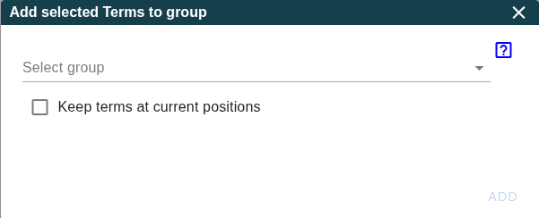
This dialog allows you to add selected Terms to an existing Group. You can open it via the Term menu or Canvas menu: (Un)Group selected > Add to existing group
Select a Group from the dropdown. If the dropdown is empty you should first create one or more Terms of type "Group", see Canvas menu Add Term
When "Keep terms at current positions" is selected, the Terms' positions are not changed, otherwise the Terms are moved to the bottom of the Group.
Pressing the ADD button will add the Terms to the selected Group.